Sure, your skills, achievements and qualifications are what really matter on your résumé, but how you present that information is just as important. In fact, a poorly designed résumé (no matter how much of a great fit you are for the job you’re applying for) can be distracting and diminish your chances of landing an interview.
But fret not. We’ve put together some expert tips on designing a custom résumé that stands out for all the right reasons.
Without further ado, here’s how to design a job-winning résumé.
1. Choose a color scheme
Using color in your résumé can help you stand out from the crowd, but you need to be thoughtful and strategic about it. Indeed, too much color can feel overwhelming and look unprofessional.
As a general rule of thumb, choose a high-contrast color scheme — and stick to it. A safe color scheme is black (for general text), white (for the background) and a third color like red, green or blue (for headings).
You can use a different color other than white for the background, but it’s best to restrict this to certain areas like the header, for example. You want your résumé to be loud, but not too loud, after all!
2. Set the margins
Generally speaking, your résumé’s page margins should be set to one inch on all sides. This keeps text away from the edge of the page, which aids in the overall readability of your résumé.
If you need more space, you can decrease the margins, but they shouldn’t be less than half an inch. Any narrower than this, and your résumé will look cluttered and be hard to read, and it might also cut off text if the hiring manager prints it off.
3. Choose a clean and professional font
Although it may be tempting to go with a fancy font on your résumé, stick to something simple, clean and easy to read, like Calibri, Helvetica, Avenir, Georgia or Garamond (generally between 10 and 12pts). You can pair fonts to make your résumé pop a little more (for example, a serif font for headings and a sans serif font for everything else), but whatever you do, don’t add more than two different fonts.
It’s worth mentioning here that not everyone will have the same fonts installed as you, so when they open your résumé, their word processor might use a default font which could hinder your document’s overall résumé layout and formatting. A great little trick around this is to embed fonts in your résumé so that font styles are maintained.
4. Keep text aligned to the left
All text on your résumé, including section headings, should be aligned to the left of the page. As recruiters are used to reading from left to right, this helps avoid unnecessary eye jumps and, ultimately, makes your résumé’s content easier to follow and scan.
That said, it’s okay to center your name and contact details in the header, but whatever you do, don’t right-align any text. The only time it’s acceptable to align text to the right of the page is for dates of employment and college attendance — use right tab stops for this.
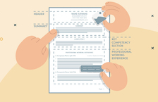
5. Create an eye-catching header
A résumé header is the topmost section of your résumé and typically includes your name and basic contact information. It’s the first thing that recruiters will look at, so it needs to look professional and grab their attention.
To make it pop, consider including a headline (a short sentence summarizing your key skills and experience) under your name, as well as links to your website, LinkedIn profile and social media pages. Debra Wheatman, President at Careers Done Right, recommends adding a link to your LinkedIn profile in your header, because “people will go check out your LinkedIn as part of looking at your overall background”.
A word to the wise, though: don’t use your word processor’s header feature for this, as applicant tracking systems often can’t “read” this area. Your résumé header should appear in the document’s main text area.
6. Divide content into clear sections
All key information should be divided appropriately into clear sections so hiring managers can easily find what they’re looking for.
Your résumé must always include these five essential sections:
- Header
- Summary or objective
- Employment history
- Education
- Skills
If you have other achievements that are relevant to the job you're applying for, meanwhile, you can also add additional sections, like languages, publications and certifications.
7. Set headings for each section
Following on from the previous tip, make sure that you add a descriptive heading for each section. You can get a little creative with what you call these headings, but it’s best to stick to more traditional names like “Experience” and “Education” so that it's clear to readers what each section is about.
To make section headings more ATS-friendly, use the H2 heading style in your chosen word processor. That said, it’s okay to simply bold the font and make it slightly larger than the section’s content.
8. Use bullet points
Bullet points help break up large blocks of text into easily digestible chunks of information, and should be used whenever possible, particularly when highlighting your accomplishments in your employment history section.
Always set off bullet points with an action word to make statements more impactful, and keep bulleted lists to one level, for example:
- This is fine.
- So is this.
- But this isn’t.
- Neither is this.
- Okay, stop. Please.
9. Use digits for numbers
To save space and make your résumé more scannable, consider replacing spelled-out numbers with digits.
It’s also a good idea to abbreviate large numbers of four digits and more, like so:
- 1K (instead of 1,000)
- 1.5M (instead of 1,500,000)
- 5.2B (instead of 5,200,000,000)
Meanwhile, when referencing numbers as “more than” or “over”, consider simply adding a plus sign at the end of the number, like so:
- 700+ (instead of “over 700”)
- 1M+ (instead of “more than 1M”)
10. Stay organized with columns and tables
A great way to organize your résumé’s content is to use columns and tables. That said, this carries a certain risk in that some ATS systems might misread your résumé, so you need to be extra careful here.
If you use columns, stick to a maximum of two and try to keep relevant information in the same column. For example, you can use a slightly smaller column for your contact details and skills, and a larger one for the main content of your résumé.
As for tables, make sure all relevant content appears in a single row. For example, you can divide your skills into two or three columns and list an equal number of skills in each one.
11. Include white space
When designing your résumé, make sure to incorporate ample white space between elements — this makes it look less crowded and more visually appealing and, ultimately, easier to read.
You can do this by adding line spacing between sections, paragraphs and text; adjusting cell margins in tables and gutter width between columns (if you use these); and, as previously mentioned, ensuring page margins are no smaller than ½ inch on all sides.
12. Get visual
If you really want your résumé to stand out, you might want to consider adding some visuals, like a professional photo, icons, charts, graphs and other design elements. Again, though, much like columns and tables, you’ll need to be very strategic in how you use visuals in your résumé, as ATS systems can’t always “read” them.
Icons, for example, should be used with an appropriate label — a telephone icon should be accompanied by the “Phone” or “Phone number” so the ATS knows what the seemingly random string of numbers is. Likewise, data in charts and graphs should be easily found — that is to say that they shouldn’t be hidden in images.
13. Mind the length
When designing your résumé, pay attention to its length. Of course, this will largely depend on your level of experience, but you should be mindful of the amount and proportions of your résumé’s various elements, including font sizes.
Generally speaking, try to keep your résumé to a maximum of two pages. If you’re just out of college and don’t have much work experience, meanwhile, one page will usually be more than enough.
14. Be consistent
Whatever you do, whether you use round or square bullets, one color for headings and another for general text, single or double line spacing between paragraphs, or Calibri or Helvetica as the main font, be consistent throughout your résumé. Otherwise, it just looks weird and rushed, and your attention to detail — a highly sought-after skill by employers — will come into question.
This is why you should always proofread your résumé (not only for grammar and spelling issues) before sending it off to potential employers. It’s also a good idea to ask a trusted friend or relative to go over your résumé — they might be able to offer you some constructive feedback on its overall design, layout and content.
15. Use a template
If you’re not quite the designer or you don’t have the time to design your own résumé, you always have the option to use a premade résumé template. That said, if you do choose to use a template, it’s incredibly important to make sure it’s optimized for ATS.
Our own collection of professionally designed templates are not only ATS-compliant but also fully customizable to fit your needs. They also come with detailed instructions and expert tips to create a job-winning résumé.
Here’s our Memorable résumé template in action:

Key takeaways
Whether you design your own résumé or you use a premade template, make sure the look fits your industry. A playful résumé design will raise a few eyebrows if you’re applying for a job in finance or legal services, for example.
That said, don’t shy away from injecting some personality into the design. After all, the more unique it is, the better are your chances of making a good impression.
As some parting advice, meanwhile, it’s a good idea to save your résumé as a PDF before submitting your application. This way, recruiters will be able to view your résumé exactly as intended — without any design and formatting mishaps.
Got a question about designing your résumé, or have a tip you’d like to share? Let us know in the comments section below!